

By: James Murphy

Recently, the last of this offseason’s several uniform changes was released when the Los Angeles Rams added some new spins on a familiar color scheme. In total, seven teams will head into the 2020 NFL season with some sort of change to their uniforms whether it be a minor tweak, a callback to a past era or something entirely different. Some hit it out of the park. Others? Not so much.
7. Atlanta Falcons
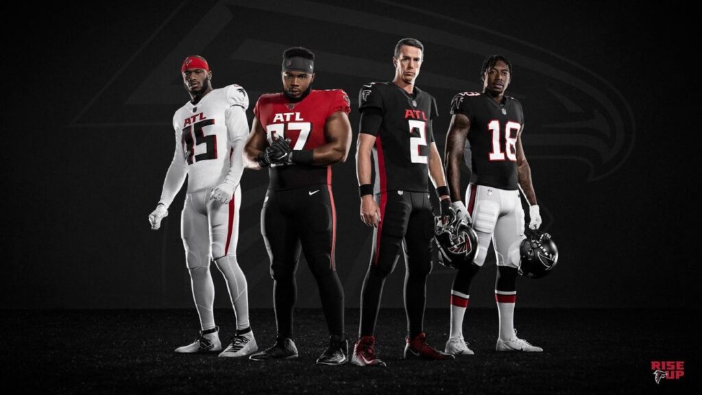
I don’t understand why the red jerseys need to fade to black at the bottom. Sometimes it works for certain teams but it just doesn’t fit well here. The number font looks like something out of an indie rock music video and it’s trying too hard to be futuristic. I would’ve liked to see them make a red version of the throwback uniforms, the overall design of those stands out more and probably looks the neatest out of all the combinations. The silver face masks don’t help at all. In short, what was an attempt to make the Falcons seem futuristic ended up having them look like the modern-day Mean Machine, and not in a good way.
Grade: D-
6. Indianapolis Colts
The first thing that popped out to me with the Colts was the block “C”. It’s visually appealing and the outline for the state of Indiana makes it unique. As for the jerseys, not many other teams have a block font for their numbers so those will help them stand out. The new word mark is an improvement and definitely easier on the eyes than the traditional one. It’s consistent with the new number font they’re trying to go with. I do wonder about the anvil swoosh on the road uniforms. It doesn’t look as good as a blue swoosh would. I’d put these changes higher on the list, but it’s not as big a change as the others and there’s not as much to go off of.
Grade: C
5. Los Angeles Rams

When this kit first dropped, much of the response was negative. People began wondering whether these uniforms were for a professional football team or for employees at a nearby IKEA. If you ask me, they’re not too bad. The detail of the horns on the helmet and shoulders is cool. It complements the chrome blue base well. There’s a lot of aspects which hint that they could be trying to set some trends when it comes to NFL uniforms. For example, instead of a traditional white road uniform they have a light shade of grey. They also have a unique tag across the left shoulder instead of the primary logo like most teams. The font for the numbers is nice and unique and the fade from yellow to white on the home uniform numbers is nice but not too showy. You may notice that these numbers have a bit of a glistening outline that really brings out the color in the jerseys. The uniforms are very good and I’m glad they stuck with the retro blue and gold, but that main logo keeps them from going any higher.
Grade: C+
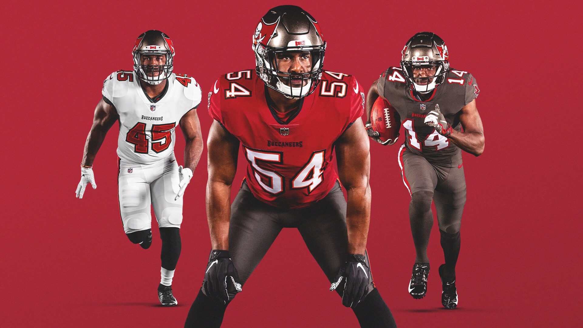
4. Tampa Bay Buccaneers

This isn’t so much of a totally new uniform so much as it is a callback to a previous generation (with the exception of the helmets). Nonetheless, it’s certainly a lot easier on the eyes than their most recent uniform combinations. We see a departure from the digital-clock style numbers and a return to the more traditional number set up. The red and white on both the home and road uniforms is complemented with just the right amount of black and creamsicle surrounding the numbers. I like the pewter color rush kit. The color in and of itself is unique to the team so why not embrace it?
Grade: B
3. Cleveland Browns
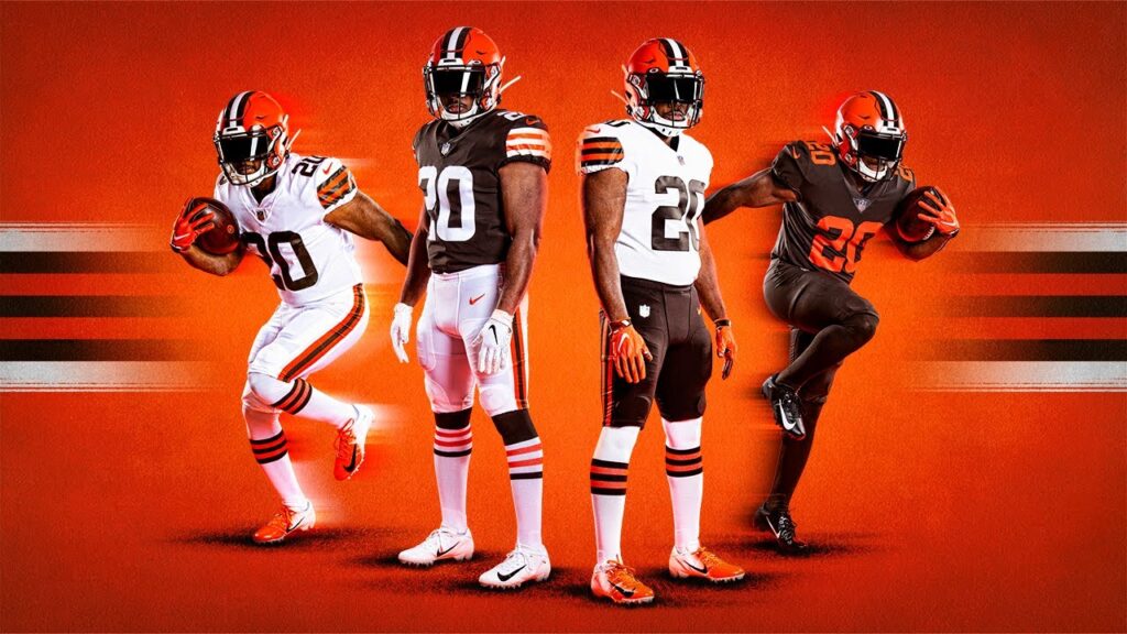
Much like the Bucs, this is less of a new concept and more of a return to previous uniforms. I like that they kept the helmets from the past few years. It jumps at you more than the previous iteration without being too harsh on the eyes. I love how they utilized stripes for most of the uniforms whether it be the socks, the pants or the shoulder pads. The brown color rush is okay, but I would’ve liked to see them have the same kind of stripes as the other uniforms, just for the sake of consistency. The numbers look a lot sleeker than those of the past few years. It was a tough choice between these guys and the Bucs for this spot, but ultimately, I like the orange, black and brown combination just a little bit better.
Grade: B+
2. New England Patriots

The Patriots’ color rush uniforms were already pretty popular and now we’ll be seeing something similar to that for the foreseeable future. You’ll notice the home uniforms showcase a slightly brighter shade of blue than the previous iteration. The most noticeable change is probably the red and white linings from the color rush uniforms replacing the singular linings from the previous uniforms which you can see on each pant leg as well. The road uniforms replace that white lining with the same shade of blue mentioned earlier. The numbers are a slightly different font and show just the right amount of silver. Overall, it’s one of the more unique and creative new uniforms of the bunch.
Grade: A-
1. Los Angeles Chargers
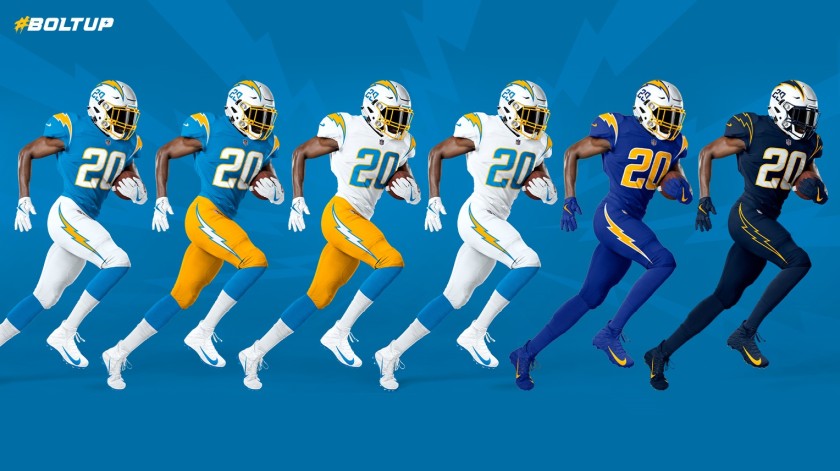
When I first saw the Chargers’ new uniforms, I could only think of two words; NAILED IT. What I love most is that this combination has something for everybody. You liked the powder blues from the team’s early days? They have that. You liked the royal blue with gold? They have that. You like the navy uniforms? Guess what? They have that, too. The lightning bolts on both the shoulders and the pants look a lot cleaner than in the past. Having them by themselves without the outline definitely helps. The new number font looks great along with the gold outline and the ones on the helmets will definitely help them to stand out. Personally, I’d like to see a pair of powder-blue pants make its way into this rotation at some point. The only real problem with these is gonna be how they can use each of these combinations enough times throughout the season.
Grade: A+
No Comments